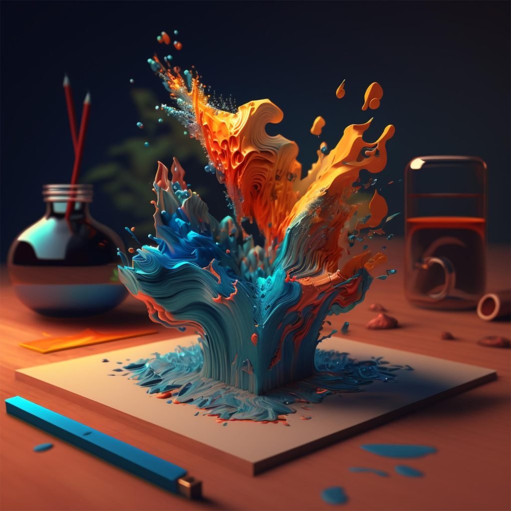
Unravelling the Spectrum: The Impact of Colors on Graphic Design
Hey there, colour enthusiasts and design mavens! Have you ever wondered why specific colours make you feel a certain way? Or why do some brands consistently use particular colour palettes in their designs? Well, you’re about to dive into the vibrant world of colours and their profound impact on graphic design. It’s not just about aesthetics; it’s a language waiting to be decoded!
Colors Speak Louder Than Words
Imagine walking into a room painted in soft blues and greens. It feels calming, right? Now, picture a room with bold reds and oranges. Energizing. That’s the power of colour. In graphic design, colours aren’t just hues; they are storytellers. They convey emotions, set moods, and can even influence decisions. Yes, the right colour can be that persuasive!
Take the colour red, for example. It’s not just the colour of love and passion but also the urgency. That’s why you see it in clearance sales and ‘Buy Now’ buttons. It grabs attention and says, “Hey, look here!” On the other hand, blue, often seen in healthcare and tech logos, radiates trust and reliability.

Creating Harmony with Colors
Like in a symphony, where every note counts, every colour plays a crucial role in design; it’s all about balance and harmony. The right colour combination can make your design pop and resonate with the audience. But how do you choose the right palette? It starts with understanding the basics of colour theory – the colour wheel, complementary colours, and the psychology of colours.
But here’s a pro tip: don’t get trapped in stereotypes. Yes, green often represents nature, but it can also be fresh, vibrant, or even luxurious (think emerald green). Break the norms, experiment, and sometimes, let the colours lead your creative journey.
Colors in Branding: More Than Just Pretty Hues
Have you ever noticed how certain brands consistently use the same colours? That’s no coincidence. Colors build brand identity. They make brands recognizable and relatable. When you see a particular shade of yellow, a specific fast-food chain might come to mind. That’s the power of colour consistency in branding.
A Splash of Color in Your Designs
So, how can you harness the power of colours in your designs? Start by understanding your message. What are you trying to convey? Who is your audience? Then, play around with palettes. Use tools like colour wheel apps to find harmonious combinations. And remember, context is critical. The same colour can have different meanings in different cultures.
Wrapping It Up with a Rainbow Bow
In the grand canvas of graphic design, colours are the brushstrokes that give life and emotion to your creations. They are not just about making things look pretty; they’re about creating a statement, telling a story, and evoking feelings. So, next time you embark on a design project, think of colours as your allies. With Magque, let’s paint the digital world with colours that catch the eye and touch the heart. Happy designing!
Read Also: