


Unveiling the Power: Color Psychology in Branding and Design
Hey there, fellow creatives! Ever wondered why some brands make you feel warm and fuzzy inside while others leave you feeling cold and indifferent? Hold onto your hats because today, we’re diving deep into the fascinating world of colour psychology in branding and design right here on Magque.
The Magic Behind the Colors
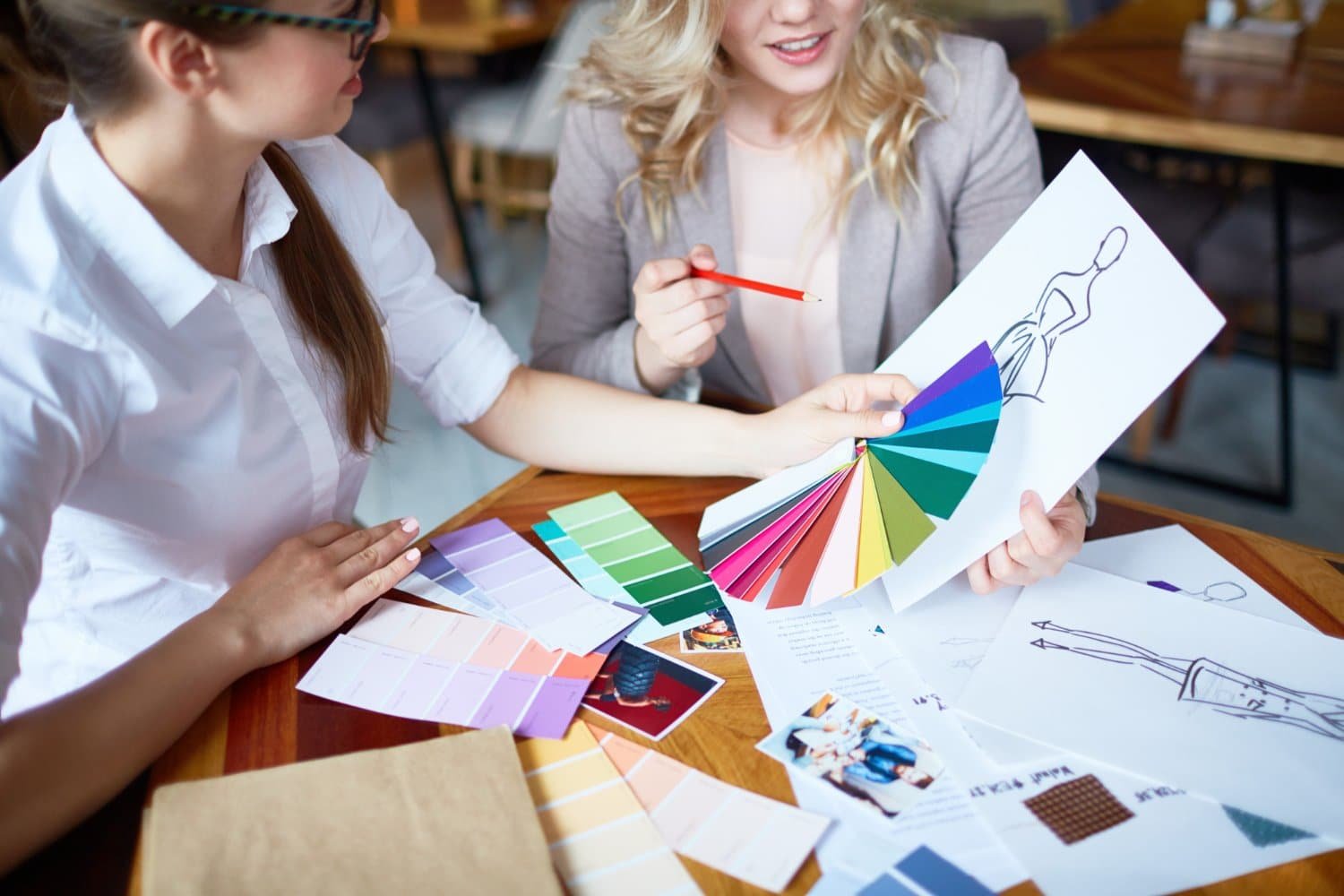
Let’s start with a question: why do we react to colours the way we do? It’s all about psychology, my friends. Colors have the power to evoke emotions, trigger memories, and even influence our behavior. From the calming blue of a tranquil ocean to the fiery red of a blazing sunset, colours speak to us on a primal level, tapping into our deepest desires and fears.

Creating Emotional Connections
Now, let’s talk turkey – how does color psychology impact branding and design? Well, think of your favourite brand. Chances are, its color scheme isn’t just a happy accident – it’s a carefully calculated choice designed to evoke specific emotions and associations. Take Coca-Cola, for example. The brand’s iconic red hue isn’t just eye-catching – it’s also associated with energy, excitement, and passion, making it the perfect fit for a company that wants to spread happiness and joy.
Choosing the Right Colors
So, how can you harness the power of color psychology in your own branding and design efforts? It all starts with understanding your audience and the emotions you want to evoke. Are you targeting adventurous thrill-seekers or sophisticated urbanites? Each demographic responds differently to colours, so choosing hues that resonate with your target market is essential.
The Language of Colors
Let’s break it down further. Here’s a quick primer on the emotions commonly associated with different colours:
- Red: Passion, energy, excitement
- Blue: Trust, calm, reliability
- Yellow: Optimism, happiness, warmth
- Green: Growth, nature, harmony
- Purple: Luxury, creativity, spirituality
- Orange: Playfulness, enthusiasm, vitality
By understanding the language of colors, you can craft a visual identity that speaks directly to your audience’s hearts – and wallets.
Putting It All Together
In conclusion, color psychology isn’t just a fancy buzzword – it’s a powerful tool for creating memorable, impactful branding and design. By choosing the right colours and understanding their emotional impact, you can forge deep connections with your audience, differentiate yourself from the competition, and build a brand that stands the test of time. So, whether you’re redesigning your logo or revamping your website, remember the power of color and wield it wisely. Your brand will thank you for it!
Read Also:


