
Hey there, design lovers! Have you ever stopped to think about the power of colors in shaping our perceptions and emotions? Buckle up because we’re about to dive into the fascinating world of color theory and its significance in modern design.
Why Color Matters
Let’s start with the basics. Colors aren’t just there to make things look pretty; they play a crucial role in communication and evoking certain feelings or responses. Think about it: how do you feel when you see a bright, cheerful yellow versus a calming shade of blue? Colors have the incredible ability to influence our mood, behavior, and even decision-making process.
The Psychology Behind Colors
Color psychology is a real thing, folks! Different colors have different psychological effects on individuals. For instance, red is often associated with passion, energy, and urgency, while green conveys feelings of growth, nature, and tranquility. By understanding these associations, designers can strategically use colors to convey specific messages or evoke desired emotions in their audience.
Creating Harmony with Color Schemes
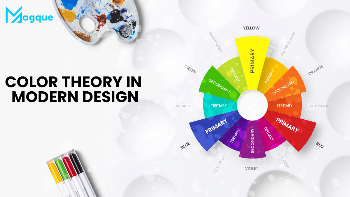
Harmony is vital in the world of design. This is where color schemes come into play. Whether monochromatic, analogous, complementary, or triadic, each color scheme has its unique vibe. By carefully selecting and balancing colors within these schemes, designers can create visually appealing compositions that captivate and engage viewers.
The Role of Color in Branding
Branding is about leaving a lasting impression, and color plays a significant role in shaping brand identity. Just think about some of the most iconic brands out there. Coca-Cola’s bold red logo exudes energy and excitement, while Facebook’s sleek blue conveys trust and reliability. By choosing the right colors, brands can effectively communicate their personality and values to consumers.
Adapting to Modern Trends
As design trends evolve, so does the use of color. In today’s digital age, minimalism and simplicity reign supreme, with neutral color palettes and clean designs taking center stage. However, that’s not to say that bold, vibrant colors don’t have their place. Pops of color can add personality and flair to an otherwise understated design, making it stand out in a crowded digital landscape.
Final Thoughts
So, there you have it, folks! Color theory is more than just a fancy concept; it’s an influential tool designers use to create impactful and visually stunning compositions. Whether crafting a brand identity, designing a website, or simply redecorating your living room, understanding the principles of color theory can take your creations to the next level. So, unleash your creativity and paint the world in vibrant glory! And be sure to explore Magque, your go-to source for the latest and most intriguing updates in the realms of informative tips & reviews!
FAQs
Q1. What is color theory, and why is it important in modern design?
Color theory is the study of how colors interact with each other and the impact they have on human emotions and perceptions. In modern design, understanding color theory is crucial because it helps designers create visually appealing compositions that resonate with their audience on a deeper level.
Q2. How does color psychology influence design decisions?
Color psychology explores the emotional and psychological effects of different colors on individuals. Designers leverage this knowledge to evoke specific feelings or responses in their audience. For example, warm tones like red or orange can create a sense of urgency or excitement, while cool tones like blue or green can induce calmness and relaxation.
Q3. What are some common color schemes used in modern design?
Modern designers often use various color schemes to create harmony and visual interest. Some typical color schemes include monochromatic (using variations of a single color), analogous (using colors that are adjacent on the color wheel), complementary (using colors that are opposite each other on the color wheel), and triadic (using three evenly spaced colors on the color wheel).
Q4. How can brands effectively use color to convey their message and identity?
Color plays a significant role in branding by helping to communicate a brand’s personality, values, and identity. Brands often choose colors that align with their message and target audience. For example, a tech company might use sleek, modern colors like blue or silver to convey innovation and trust. At the same time, a youth-oriented brand might opt for vibrant, energetic colors like orange or yellow to appeal to a younger demographic.
Q5. What are some emerging trends in color usage in modern design?
In today’s digital age, designers are experimenting with new color trends to stay relevant and capture the audience’s attention. Some emerging trends include using bold, vibrant colors to create striking visual contrasts, incorporating gradient and duotone effects for depth and dimension, and reviving retro color palettes for a nostalgic feel. Additionally, minimalist designs with neutral color schemes continue to be popular, emphasizing simplicity and elegance.
Read Also This:- The Evolution of Minimalist Design


