

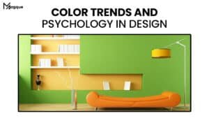
The Magic of Colors: Unraveling the Art of Web Design with Color Theory
Welcome to the vibrant world of web design, where every pixel tells a story, and colours are the brushstrokes that bring your digital canvas to life. This comprehensive guide delves into the enchanting realm of Color Theory, uncovering the secrets that can elevate your website’s aesthetics and user experience to new heights.
Understanding the Basics: Color 101
Let’s start with the basics before we embark on this colourful journey. Colours evoke emotions, convey messages, and create a visual hierarchy on your website. The colour wheel, our artist’s palette, is divided into primary, secondary, and tertiary colours, each with a unique charm.
The Power of Primary Colors
Think of primary colours as the superheroes of the colour wheel – red, blue, and yellow. They are the foundation, the building blocks from which all other colours emerge. Like superhero teams, they work together to create a harmonious visual experience.
Mixing and Mingling: Secondary and Tertiary Colors
Secondary colours, born from the union of primary colours, offer a broader spectrum. Green, orange, and purple add depth and variety. Tertiary colours, the love children of primary and secondary colours, bring nuances and subtleties, allowing for intricate design possibilities.
Creating Harmony: Color Schemes
Imagine your website as a symphony of colours, each playing a unique role. Colour schemes, the musical notes of web design, dictate the mood and tone. Let’s explore a few popular ones:
Monochromatic Marvels
In the world of monochromatic colour schemes, simplicity reigns supreme. Stick to variations of a single colour, and watch your website exude elegance and cohesion.
Dynamic Duos: Complementary Colors
Complementary colours, found opposite each other on the colour wheel, create a bold and striking visual impact. Think blue and orange or red and green – a powerful duo that demands attention.
Triadic Triumphs
For those seeking a balanced yet vibrant palette, triadic colour schemes come to the rescue. Choose three evenly spaced colours on the colour wheel, and let the magic unfold.
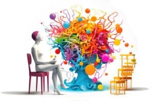
The Psychology of Colors: Making Connections
Colours are not just pretty pixels; they evoke emotions, trigger memories, and influence behaviour. Consider the psychological impact when selecting your website’s colour scheme.
The Red Allure
Red, the colour of passion and urgency, can stimulate appetite and grab attention. It’s no coincidence that many food and retail websites incorporate this fiery hue.
The Calming Blues
On the other end of the spectrum, blue radiates calmness and trust. It’s a popular choice for corporate websites, symbolizing reliability and professionalism.
Bursting the Bubble: Perplexity and Burstiness in Color Choices
Now, let’s add a twist to our colourful tale – the concepts of perplexity and burstiness. Perplexity, the element of surprise, can be achieved by introducing an unexpected colour that disrupts the established palette. Burstiness, the controlled chaos, involves strategically placing bursts of vibrant colours to capture attention without overwhelming it.
Conclusion: Painting Your Digital Masterpiece
As we conclude our journey through the captivating world of Color Theory in Web Design, remember that your website is your canvas, and colours are your paint. Embrace the magic of the colour wheel, experiment with schemes, and play with your audience’s emotions. By understanding the psychology of colours and incorporating elements of perplexity and burstiness, you can create a visually stunning and user-friendly website that leaves a lasting impression.
So, go ahead, pick up your digital brush, and let the colours flow. Your masterpiece awaits on the digital canvas of the web!
Explore more captivating insights on web design and digital trends at Magque.
FAQs
Q1: Why is Color Theory critical in web design?
A: Color Theory is crucial in web design because it influences user experience, evokes emotions, and communicates messages. Proper use of colours enhances aesthetics, establishes brand identity, and helps guide users through the website with visual hierarchy.
Q2: How do I choose a suitable colour scheme for my website?
A: Selecting a suitable colour scheme involves considering the nature of your content, your target audience, and the emotions you want to evoke. Pay attention to monochromatic, complementary, or triadic colour harmonies, and ensure the chosen scheme aligns with your brand personality.
Q3: Can colours impact user behaviour on a website?
A: Absolutely. Colours have psychological effects that can influence user behaviour. For example, warm colours like red and orange may create a sense of urgency, while cool colours like blue and green can promote calmness. Understanding the psychology of colours allows designers to tailor the user experience accordingly.
Q4: How can I add an element of surprise using perplexity in colour choices?
A: To introduce perplexity, consider adding a pop of unexpected colour within a predominantly harmonious colour scheme. This incredible colour can draw attention to specific elements or calls to action, creating visual interest and leaving a memorable impression on users.
Q5: What is burstiness in the context of Color Theory in web design?
A: Burstiness involves strategically incorporating bursts of vibrant colours to capture attention without overwhelming the overall design. These bursts can be used sparingly for buttons, headlines, or other essential elements, creating focal points that guide users through the content while maintaining a visually pleasing balance.
Read More :- 2024’s Top Graphic Design Trends


