
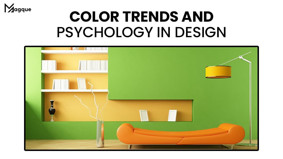
Have you ever walked into a room and felt instantly calm or maybe energized? It’s not just about the space itself, but the colors that paint its personality. At Magque, we dive deep into how color trends and psychology influence design in 2024, ensuring that every hue we choose sends the right message.
Why Do Colors Matter in Design?
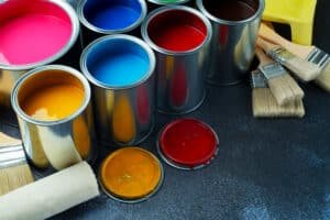
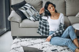
Colors aren’t just pretty to look at; they carry a heavyweight in psychological value. Each shade you see has the power to affect your mood, your thought process, and even your willingness to enter a room. Ever noticed how many fast-food restaurants bathe their interiors in reds and yellows? It’s because these colors are known to stimulate appetite and convey a sense of urgency. Now, imagine using this kind of psychological insight into your design projects. Intriguing, right?
The Hottest Color Trends of 2024
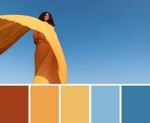
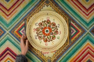
This year, the color palette takes a fascinating turn. We’re seeing a bold mix of tranquility and energy, with earthy tones like hazelwood and terracotta making a strong statement. These colors aren’t just chic; they evoke a sense of grounding and stability, perfect for creating a serene workspace or a cozy home environment.
On the flip side, we’ve got vibrant pops of peacock blue and digital lavender, breathing life and innovation into more dynamic spaces. These are not just colors; they’re conversation starters. They’re how you tell the world that a space is alive and buzzing with creativity.
Integrating Color Psychology into Your Projects
So, how can you harness the power of color psychology? First, think about the mood you want to evoke. Looking for a calming atmosphere? You might lean towards soft blues and greens, which have a soothing effect on the mind and can help reduce stress.
If you’re designing a gym or a creative workspace, vibrant oranges or inspiring purples might be your go-to, as they boost energy levels and encourage creative thinking. It’s all about the feeling you want to convey.
Practical Tips for Using Colors in Design
- Test your colors: Before going all out, test your colors in the intended environment. Lighting can significantly affect how a color is perceived.
- Mix and match: Don’t be afraid to combine colors. Sometimes, a dash of contrast is what you need to make a design stand out.
- Keep up with the trends: While it’s great to have a signature style, staying updated with color trends can give your designs a fresh and modern feel.
Incorporating these tips can turn a standard project into something truly spectacular.
Wrap-Up
At Magque, we believe that understanding the trends and psychology behind colors can transform good design into great design. Whether you’re a budding designer or a seasoned pro, taking the time to explore how colors affect us all can elevate your projects to new heights. So, what’s your next project going to look like? Let these insights paint your imagination with possibilities!
Colors do more than fill spaces. They express personality, evoke emotions, and create atmospheres. As we continue to explore the fascinating interplay of color trends and psychology, remember that each hue you choose is more than a visual choice—it’s a psychological one. So, let’s color wisely.
FAQs
Q1. What is color psychology in design?
Color psychology in design refers to the study of how colors influence human behavior and emotions. It explores how different hues can affect perceptions, moods, and actions, making it a crucial consideration in everything from interior design to branding and marketing.
Q2. How do current color trends influence design choices?
Current color trends can dictate the popularity of certain shades in various design fields, influencing everything from fashion and home décor to graphic design. Designers often use these trends to stay relevant and appealing to consumers, integrating the latest popular colors to create fresh and engaging designs.
Q3. Can color choices in a workspace affect productivity?
Yes, color choices in a workspace can significantly affect productivity. For example, blue is known to promote intellectual thought and calm, making it ideal for intensive work environments, while green can reduce eye strain and promote a sense of balance.
Q4. What are some tips for choosing the right colors for my project?
When choosing colors for a project, consider the psychological effects of different hues, the purpose of the space or product, and the target audience. It’s also important to test colors in the actual environment where they will be used to see how they interact with lighting and other elements.
Q5. How often do color trends change in design?
Color trends in design can change annually, with influences stemming from cultural shifts, technological advancements, and socio-economic factors. Designers and companies often look to trend forecasts from industry leaders like the Pantone Color Institute to stay ahead.
Read Also This – Color Theory in Modern Design


