
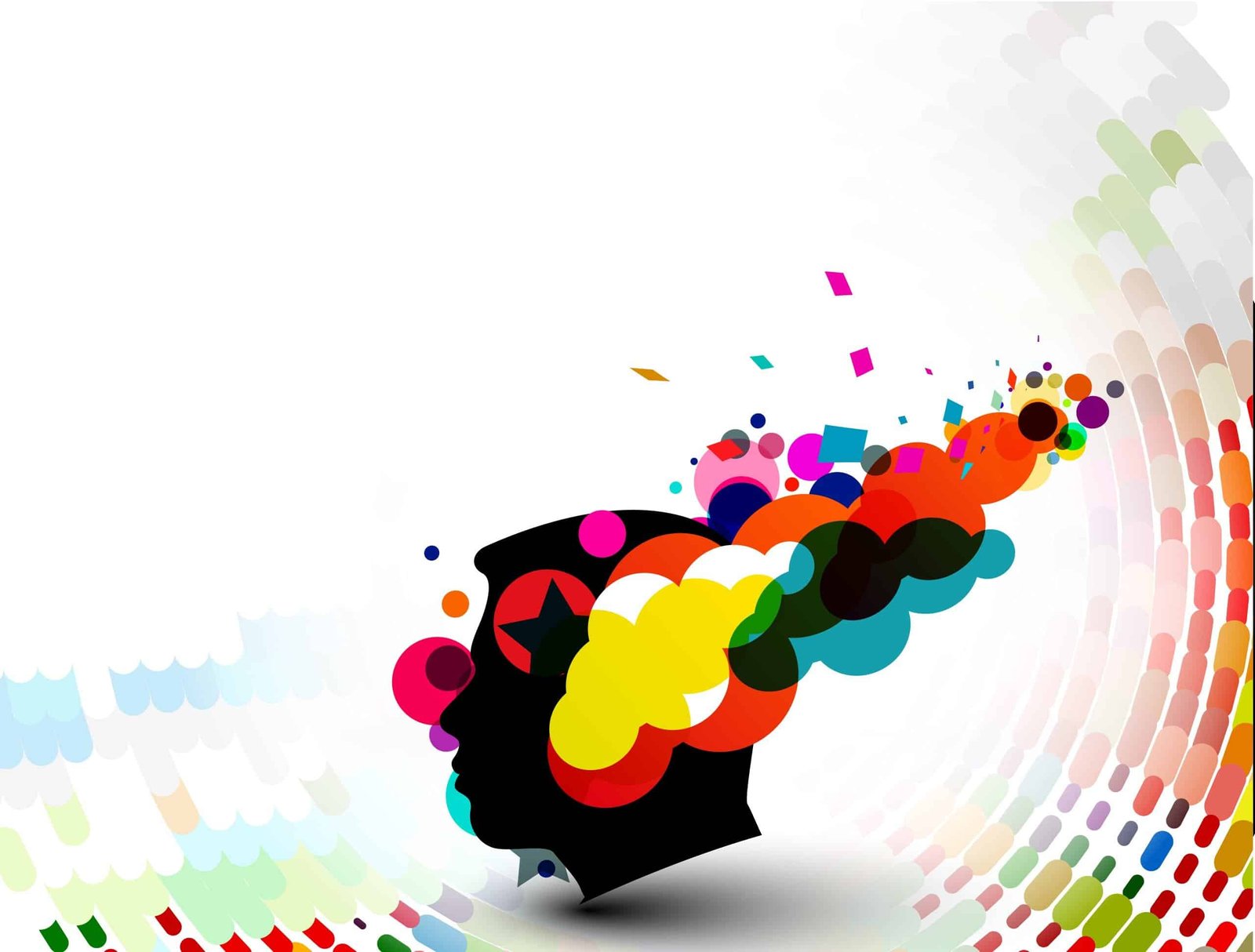
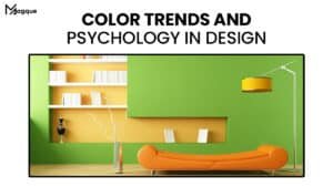
The Impact of Color Psychology in Design
Hey there, design lovers! Have you ever wondered why specific colours make you feel happy and energized while others leave you calm and relaxed? Well, you’re not alone. The design world is filled with colour psychology – the study of how colours affect human emotions and behaviours. And let me tell you, it’s fascinating stuff!
Why Color Matters
Picture this: you’re browsing the web for a new pair of shoes. You come across two websites – one with a bright, vibrant colour scheme and another with muted pastel tones. Which one catches your eye? Chances are, you’re drawn to the vibrant site like a moth to a flame. That’s the power of colour psychology at work.

Creating Emotional Connections
Colour isn’t just about aesthetics – it’s about creating emotional connections with your audience. Think about your favourite brand. What colours do they use in their logo and branding? Chances are, those colours evoke specific emotions and associations that resonate with you subconsciously. Whether it’s the bold red of Coca-Cola or the calming blue of Facebook, colours play a crucial role in shaping brand identity and perception.
Understanding Color Associations
Different colours evoke different emotions and associations. For example, red is often associated with passion, energy, and excitement, while blue is associated with calmness, trust, and reliability. By understanding these colour associations, designers can strategically use colour to evoke specific emotions and convey messages to their audience.
Harnessing the Power of Color
So, how can you harness the power of colour in your designs? Here are a few tips:
- Know Your Audience: Understand who your audience is and what emotions you want to evoke. Are they young and energetic or mature and sophisticated? Tailor your colour choices accordingly.
- Use Color Theory: Familiarize yourself with colour theory and the principles of colour harmony. Experiment with complementary, analogous, and monochromatic colour schemes to create visually appealing designs.
- Test and Iterate: Feel free to experiment with different colour combinations and see what resonates with your audience. A/B testing can help you determine which colours most effectively achieve your design goals.
- Consider Cultural Differences: Color associations can vary across cultures and regions. What may be perceived as positive in one culture may be seen as negative in another. Be mindful of cultural sensitivities when choosing colours for your designs.
Conclusion: Color Your World
In the design world, colour is more than just a visual element – it’s a powerful tool for evoking emotions, conveying messages, and shaping perceptions. By understanding the principles of colour psychology and harnessing the power of colour in your designs, you can create impactful and memorable experiences for your audience. So, colour your world with Magque and watch your designs come to life!
Read Also:


