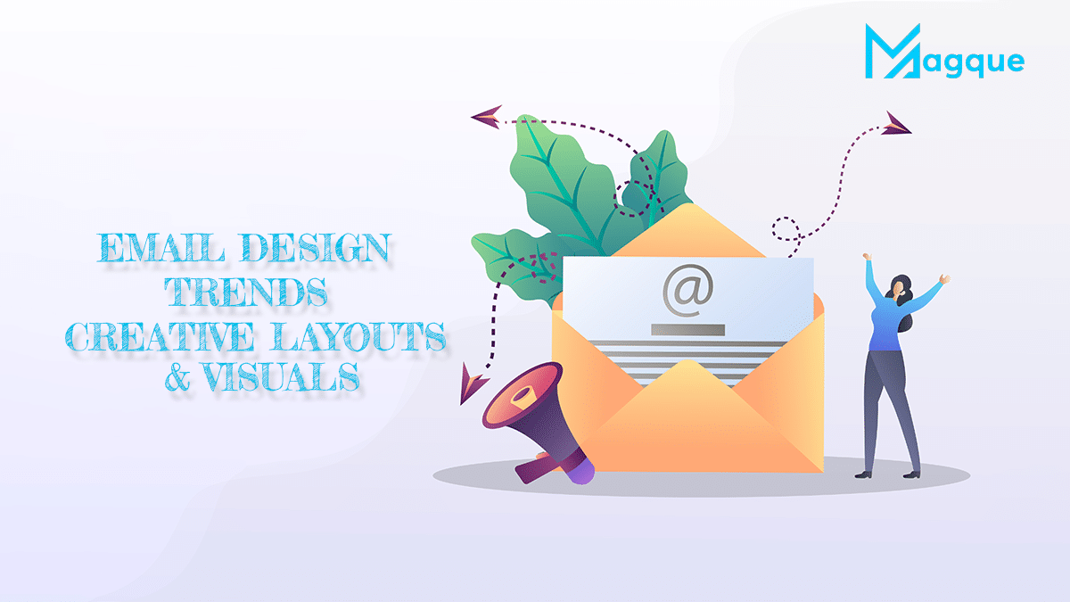
Hey there! Have you ever caught yourself staring at an email because it was just that visually appealing? Prepare to be amazed even more as we dive into the hottest email design trends of 2024 that reshape how we view our inboxes. At Magque, we’re all about staying ahead of the curve, and today, I’m thrilled to share with you the creative layouts and visuals that are setting the email marketing world on fire!
Why Should You Care About Email Design?
First off, let’s get real. In a world where our inboxes are bombarded daily, standing out is no longer just an option—it’s a must. The right design can differentiate between being seen or sent straight to the trash. It’s not just about looking pretty; it’s about creating a connection and making email fun again!
Bold Layouts That Break the Mold
Gone are the days of one-size-fits-all email templates. In 2024, it’s all about boldness and creativity. Think asymmetrical layouts, dynamic grids, and even interactive elements that turn your emails into a mini adventure for the reader. Have you ever thought of an email that changes as you scroll? Well, it’s happening and as cool as it sounds.
Colour Me Impressed: The Visual Feast
Colour palettes are going bolder, brighter, and more unexpected. Neon accents, pastel backgrounds, and gradient overlays are not just trends but statements. They’re about crafting an atmosphere that transports your reader, making each email a visual feast that’s hard to forget.
Typography That Talks
Let’s talk type. Typography in emails is getting a significant makeover. We’re seeing a resurgence of custom fonts, mixed typography, and playful sizes that enhance readability and add personality. Imagine opening an email and feeling like it’s speaking directly to you in a font so unique it’s practically whispering your name.
Imagery That Tells a Story
Images in emails are no longer just placeholders. They’re storytellers. High-quality, authentic images and even hand-drawn illustrations are making their way into email designs, creating a more personal and engaging experience. These visuals don’t just complement the text; they enhance the story, making every email a journey worth taking.
Animations and GIFs: The Cherry on Top
Remember when animations in emails were a big no-no? Well, not anymore! Strategically placed animations and GIFs are making emails come to life. From subtle movements to eye-catching loops, these elements add a layer of entertaining and informative dynamism.

So, What’s the Big Deal?
In essence, the big deal is all about connection. These design trends are more than just aesthetic choices; they’re tools to build deeper relationships with your audience. They’re about making every email a memorable experience that delights, informs, and, most importantly, resonates.
At Magque, embracing these trends is not just about staying relevant; it’s about leading the charge in a digital world where creativity knows no bounds. So, whether you’re crafting a newsletter, a promotional email, or a heartfelt thank-you note, remember: your design is your voice. Make it loud and clear, but most of all, make it uniquely you.
Cheers to making inboxes a brighter, more engaging place in 2024 and beyond! Stay creative, stay bold, and never underestimate the power of a well-designed email.
FAQs
Q1. What are the top email design trends for 2024?
In 2024, email design is all about innovation and engagement. Top trends include bold, asymmetrical layouts, dynamic use of colour with neon and pastel palettes, custom and playful typography, authentic imagery or hand-drawn illustrations, and the strategic use of animations and GIFs to add life to your messages. These elements are designed to captivate readers and create memorable experiences.
Q2. How can I make my emails stand out with creative layouts?
Experiment with breaking the :
- Use an experimental layout mould to make your emails stand out.
- Ry uses asymmetrical or broken grid layouts to add visual interest.
- Incorporate interactive elements like hover effects or accordion features that encourage readers to engage with your content.
He aims to create a visually appealing, interactive experience that grabs attention from the get-go.
Q3. Why are bold and unexpected colour schemes recommended?
Bold and unexpected colour schemes can make your emails pop and draw the reader’s eye. In a crowded inbox, using distinctive colours can set your message apart, evoke emotions, and help convey your brand’s personality. Neon accents, gradients, and pastel backgrounds are not only visually striking. Still, they can also enhance your emails’ readability and overall aesthetic appeal.
Q4. What role does typography play in modern email design?
Typography in email design has evolved to become a crucial element in conveying your brand’s voice and tone. Using custom fonts, mixing font styles, and playing with size can add personality to your emails and improve readability. Creative typography helps highlight critical messages and guide the reader through the content more engagingly.
Q5. Are animations and GIFs effective in email marketing?
Yes, when used strategically, animations and GIFs can significantly enhance the effectiveness of email marketing. They can grab attention, explain complex ideas, and add a fun element to your emails, making them more engaging. However, it’s essential to use them sparingly and ensure they complement your message without distracting from the main content or slowing down email load times.
Read Also This:- Best Practices for Email Marketing in 2024


