
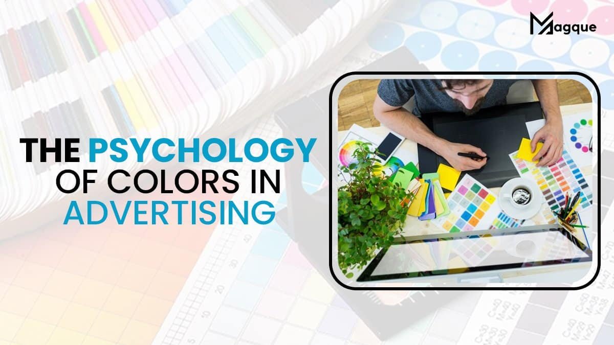
The Psychology of Colors in Advertising
When you stroll through a shopping mall, scroll through your social media feed, or even watch a TV commercial, what’s the one thing that consistently captures your attention? It’s the colours! The psychology of colours in advertising is a fascinating world that influences our decisions and emotions more than we might realize. In this article, we’ll delve into the captivating realm of colour psychology and how it plays a pivotal role in the success of advertising campaigns.
Colour Psychology Unveiled
Colour is More than Meets the Eye: Beyond aesthetics, colours carry profound psychological meanings and triggers. Each colour has the power to evoke specific emotions and perceptions. For instance, red can ignite passion and excitement, while blue exudes trust and reliability. Understanding these nuances is crucial for advertisers aiming to connect with their target audience on a deeper level.
Emotions in Every Hue: Using colours in advertising is an art form. Warm colours like yellow and orange can make viewers feel cheerful and optimistic, making them ideal for brands wanting to evoke positivity. On the other hand, cool colours such as green and purple can create a sense of calm and serenity, perfect for health and wellness brands.
Building Brand Identity: Colors play a pivotal role in establishing brand identity. Think about the golden arches of McDonald’s or the vibrant red of Coca-Cola. These colours have become synonymous with their brands, making them instantly recognizable. It’s a testament to the power of colour in creating brand consistency and recall.
The Colorful Impact on Consumer Behavior
First Impressions Matter: In advertising, you only have a few seconds to make a lasting impression. Colours can make or break that impression. Did you know 90% of product snap judgments can be based on colour alone? A well-chosen colour palette can entice consumers to explore further or turn them away instantly.
Call to Action (CTA): The colour of your CTA button can significantly impact click-through rates. Imagine a “Buy Now” button in red versus grey – the red one is more likely to prompt action because it creates a sense of urgency and excitement.
Cultural Considerations: Colors also have different cultural connotations. For example, while white signifies purity and simplicity in Western cultures, it represents mourning in some Asian cultures. Advertisers must be mindful of these cultural nuances when targeting a global audience.
Crafting a Colorful Advertising Strategy
Know Your Audience: Understanding your target audience is the first step in crafting a successful advertising campaign. Conduct market research to determine which colours resonate most with your demographic. Are they looking for trustworthiness, innovation, or excitement?
Consistency is Key: Maintain consistency in your colour scheme across all marketing channels. This consistency reinforces your brand identity and makes your messaging more memorable.
A/B Testing: Be bold and experiment with different ad colour variations. A/B testing can help you identify which colours resonate best with your audience and lead to higher conversions.
In Conclusion
In the world of advertising, where the competition is fierce and attention spans are short, the psychology of colours is a powerful tool at your disposal. By harnessing the emotional and psychological impact of colours, you can create advertising campaigns that capture attention and drive action. So, the next time you see a colourful advertisement, consider the strategic use of colours and how they’re influencing your decisions.
Colours are more than just shades on a palette; they’re the vibrant threads that weave the tapestry of successful advertising. As you embark on your next advertising journey, remember the words of the great artist Pablo Picasso, “Colors, like features, follow the changes of the emotions.” Make sure the emotions your brand conveys are the ones that resonate with your audience.
Understanding the psychology of colours in advertising is not just about aesthetics; it’s about connecting with people on a deep, emotional level. So, go ahead and paint your advertising masterpiece with the colours of persuasion, trust, and engagement!
And be sure to explore Magque, your go-to source for the latest and most intriguing updates in the realms of informative tips & reviews!
FAQs
Q1. How do colours in advertising affect consumer behaviour?
Colours can influence emotions and perceptions, which, in turn, impact consumer behaviour. For example, warm colours like red and orange can create a sense of urgency. In contrast, more excellent colours like blue and green can convey calmness and trustworthiness.
Q2. What is the significance of colour consistency in branding?
Colour consistency is crucial in branding because it helps create brand recognition and recall. When consumers consistently see a specific colour associated with a brand, it becomes deeply ingrained in their memory, making the brand more recognizable and memorable.
Q3. Are the effects of colour psychology universal or culture-specific?
While some colour associations are universal (e.g., red often symbolizes passion and love), others can be culture-specific. For instance, the colour white represents purity in Western cultures but is associated with mourning in some Asian cultures. Advertisers should consider cultural nuances when using colours in international campaigns.
Q4. How can I choose the right colours for my advertising campaign?
Choosing the right colours involves understanding your target audience and the emotions and perceptions you want to evoke. Conduct market research to determine which colours resonate most with your demographic, and consider A/B testing to find the most effective colour combinations.
Q5. Do different industries benefit from specific colours in advertising?
Yes, different industries can benefit from specific colour choices. For example, the food industry often uses warm and appetizing colours like red and orange. In contrast, the healthcare industry uses calming and trustworthy colours like blue and green. However, the effectiveness of colours can also depend on the specific message and context of the advertisement.
Read Also This :- Color Theory in Web Design A Comprehensive Guide


