


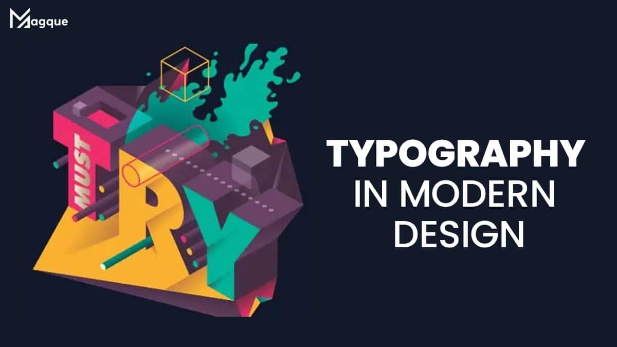
Typography, often overlooked in design, is pivotal in shaping modern digital content’s visual appeal and effectiveness. Imagine entering a beautifully designed website where every word effortlessly guides you through the page, captivating your attention with its elegant fonts and strategic placement. That’s the magic of typography, the art and technique of arranging type to make written language legible, readable, and appealing when displayed. In today’s digital landscape, where attention spans are fleeting and competition is fierce, mastering the art of typography can be the difference between a forgettable website and one that leaves a lasting impression.
First impressions matter, and typography is often the first element of design that users encounter when visiting a website or engaging with digital content. As we carefully choose words to convey meaning and emotion, selecting the right typeface can evoke specific feelings and set the tone for the entire user experience. Whether a sans-serif font’s bold confidence or a serif’s timeless elegance, each typeface carries its personality and communicates a distinct message to the audience.
But typography is more than just choosing pretty fonts; it’s about creating harmony and balance within the design. Every detail contributes to the text’s overall readability and aesthetic appeal, from line to letter spacing. Consider the whitespace surrounding each letter, like the book’s margins or the padding between paragraphs. When properly utilized, whitespace allows the text to breathe, enhancing comprehension and guiding the reader’s eye effortlessly across the page.
In the fast-paced world of digital marketing, where content is king, typography can be a powerful tool for conveying information quickly and effectively. Using hierarchy and contrast, designers can emphasize key points, guide the reader’s attention, and create a sense of flow within the content. Imagine a headline that grabs your attention with its bold font, followed by subheadings that provide additional context, and body text that keeps you engaged with its readability and clarity. That’s the power of typography in action, guiding the user through the content and ensuring that the message is seen and understood.
Moreover, typography plays a crucial role in brand identity and recognition. Just as a logo communicates the essence of a brand through visual imagery, the choice of typography can reinforce brand values and personality traits. Think of iconic brands like Coca-Cola or Nike, each with its distinctive font that instantly evokes emotions and associations. Whether it’s the playful curves of Disney’s logo or the sleek minimalism of Apple’s typography, these brands have mastered using type to communicate their identity and establish a strong brand presence.
In conclusion, typography is an essential element of modern design that can elevate digital content from ordinary to extraordinary. By carefully selecting fonts, considering spacing and hierarchy, and harnessing the power of typography to convey meaning and emotion, designers can create captivating experiences that resonate with audiences on a deeper level. So the next time you’re crafting a website, designing a marketing campaign, or creating content for your brand, remember the power of typography and its impact on shaping perceptions and driving engagement. And be sure to explore Magque, your go-to source for the latest and most intriguing updates in the realms of informative tips & reviews!
FAQs
Q1. Why is typography important in modern design?
Typography is the foundation of modern design by enhancing readability, guiding user experience, and conveying brand identity. In an era of abundant digital content, well-chosen typography can help websites stand out, communicate effectively, and leave a memorable impression on users.
Q2. How does typography contribute to user experience?
Typography greatly influences user experience by affecting readability, hierarchy, and visual appeal. Clear and well-structured typography can make content easier to understand, navigate, and engage with, thus improving a website’s or digital platform’s overall user experience.
Q3. What factors should be considered when choosing typography for a design project?
When selecting typography for a design project, factors such as readability, brand identity, target audience, and platform compatibility should be considered. Choosing fonts that align with the brand’s personality, resonate with the target audience, and are legible across various devices and screen sizes is essential.
Q4. How can typography be used to convey brand identity?
Typography plays a crucial role in establishing and reinforcing brand identity. By selecting fonts that reflect the brand’s values, tone, and personality, designers can create a cohesive visual language that resonates with consumers. Consistent use of typography across all brand materials helps build brand recognition and strengthens brand recall.
Q5. What are some common typography mistakes to avoid in modern design?
Common typography mistakes in modern design include using too many fonts, neglecting hierarchy, ignoring readability, and overlooking accessibility. Designers should strive for simplicity, consistency, and clarity in typography, ensuring that the chosen fonts enhance rather than detract from the overall design and user experience. Additionally, attention to factors like line spacing, letter spacing, and contrast can help avoid typographic errors and ensure optimal readability.
Read Also This:- Latest Trends in Web Design


