
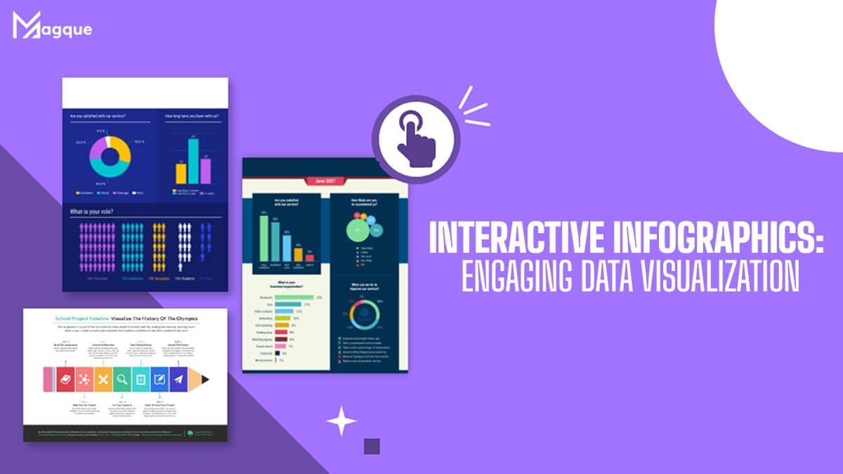
Hey there! Have you ever zoned out while trying to digest pages of dense data? We’ve all been there. But what if I told you there’s a way to make data digestible and delightful? Enter the world of Interactive Infographics. It’s like the difference between reading a recipe and baking the cake. You’re not just observing; you’re participating. And that’s what we’re diving into today at Magque.
So, what’s the big deal with interactive infographics? Imagine seeing a chart unfolding in real-time, highlighting trends you care about, or hovering over a map to reveal hidden stories in the data. It’s about bringing data to life, making it dance at your fingertips. It turns the mundane into the magical, transforming how we perceive and interact with information.
But why should you care? For starters, interactive infographics are a game-changer in education and marketing. They have this unique ability to engage users, encouraging them to explore and discover new insights independently. It’s one thing to tell someone about the growth of renewable energy; it’s another to let them explore its rise across the globe, year by year, through an interactive map.
For marketers, educators, and data enthusiasts, this is powerful stuff. It’s not just about presenting data; it’s about telling a story. And everyone loves a good story. A well-crafted infographic can take your audience from curiosity to understanding, maybe even to that “aha” moment we all crave.
But let’s get practical for a moment. How do you create an interactive infographic that engages? It starts with understanding your audience. What do they care about? What questions might they have? Then, it’s about simplicity. Yes, the irony of using sophisticated tech to advocate for simplicity isn’t lost on me. But the goal is to make complex data accessible, not overwhelming.
And here’s where the art of visualization comes in. It’s about choosing the right tools and platforms that allow your data to shine. Tools that let your audience interact with the data in meaningful ways, whether that’s through sliding scales, clickable legends, or dynamic charts.
So, what’s the takeaway here? Interactive infographics are more than just pretty pictures. They’re a bridge between data and decision-making, between curiosity and understanding. They turn passive viewers into active participants, and that’s powerful.
At Magque, we believe in the power of engaging data visualization. It’s not just about seeing the numbers; it’s about understanding the story they tell. So, next time you face the daunting task of presenting data, ask yourself: how can I make this interactive? How can I turn this into a story that informs and engages?
FAQs
Q1. What exactly are interactive infographics?
A. Interactive infographics are dynamic visuals that allow users to engage directly with the data. Unlike static images, these infographics respond to user interactions, such as clicks, hovers, or drags, offering a more immersive and personalized data exploration experience. They can include animations, clickable elements, or elements that change as the user interacts with them, making complex information more accessible and engaging.
Q2. Why should I use interactive infographics instead of traditional ones?
A. The main advantage of interactive infographics is engagement. By allowing users to interact with the data, you capture their attention longer and facilitate a deeper understanding of the content. This interactivity can lead to better retention of information and can make the exploration of data more intuitive and enjoyable. They’re handy for complex datasets where user engagement can lead to more personalized insights.
Q3. How can interactive infographics benefit my business or educational project?
A. For businesses, interactive infographics can significantly enhance marketing efforts by engaging potential customers uniquely and memorably. They can also be powerful tools for internal reports, making data analysis more interactive and decision-making processes more informed. In education, they offer a dynamic learning tool that can accommodate different learning styles, making complex data more understandable and engaging for students.
Q4. What tools can I use to create interactive infographics?
A. Several tools are available for creating interactive infographics, ranging from user-friendly platforms for beginners to more advanced software for professionals. Some popular options include Adobe Spark, Canva, Infogram, and Tableau Public. These platforms often offer templates and drag-and-drop interfaces to simplify the design process, making creating compelling and interactive visualizations easier.
Q5. Are there any best practices for designing interactive infographics?
A. Yes, there are several critical practices to keep in mind:
- Start with a clear goal: Know what you want to achieve with your infographic and what action you want users to take.
- Simplify your data: Make sure your audience is manageable. Highlight the most important data points and use interactions to reveal more detailed information.
- Optimize for all devices: Ensure your interactive infographic is responsive and accessible on desktop, tablet, and mobile devices.
- Test user engagement: Use analytics to see how users interact with your infographic and adjust based on those insights.
- Keep it accessible: Make sure your interactive elements are accessible to all users, including those with disabilities, by following web accessibility guidelines.
Read Also This:- B2B Content Marketing Trends and Innovations


